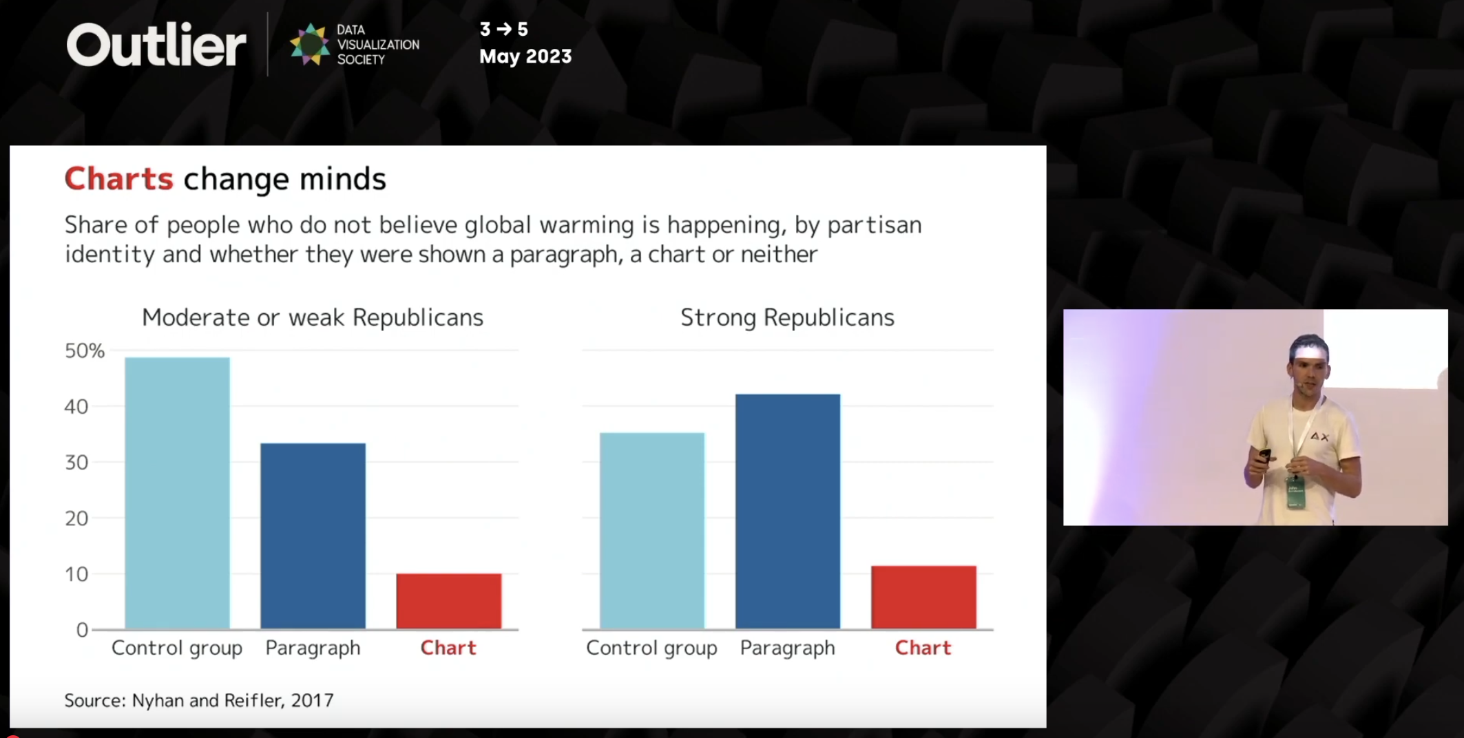
In a recent talk by John Burn-Murdoch he presented a study showing Republicans were 3-4x more likely to accept climate science when presented with a chart vs. a paragraph of statistics. That’s a stunning difference, and I’m sure goes for both sides. People tend to automatically perceive charts as more objective, and, apparently, persuasive.

Bar chart titled 'Charts change minds' showing the percentage of Republicans who do not believe global warming is happening, comparing control group, paragraph, and chart presentation methods. The data from Nyhan and Reifler (2017) shows that both moderate/weak and strong Republicans were significantly less likely to deny climate change when presented with charts (around 10%) versus control groups (35-50%) or paragraph presentations (33-42%). John Burn-Murdoch is visible presenting the slide at the Outlier conference in May 2023.