I gave this presentation to the Portland Data Visualization Society in 2023. Even though it's a couple years old it's still a good introduction to the different graphics APIs in use today. In coming posts I'll address the evolving landscape of web graphics including WebGPU, optimizing for mobile, and enhanced accessibility integration for Canvas and WebGL/WebGPU Ever tried to animate thousands of data points and watched your computer start to steam? Or maybe you’ve dreamed of encoding your data in seas of glowing point clouds, only to have it look more like a pixelated sludge?
You’re not alone. Most data visualizations on the web run on SVG, and for good reason; it’s relatively straightforward, has built in ways to make it accessible, and it’s reliable.
But sometimes, when you’re working with SVG, you start to come up against barriers. Perhaps your graphics are taking forever to load. Maybe you need to display more data points to communicate concepts without introducing biases. Or, perhaps, you just really really want your bar chart to apparate in a three-dimensional sparkly fog.
Whatever it is, sometimes, SVG just isn’t the answer.
That’s where Canvas and WebGL come in—two more Javascript graphics APIs.
Different APIs make different visualizations possible
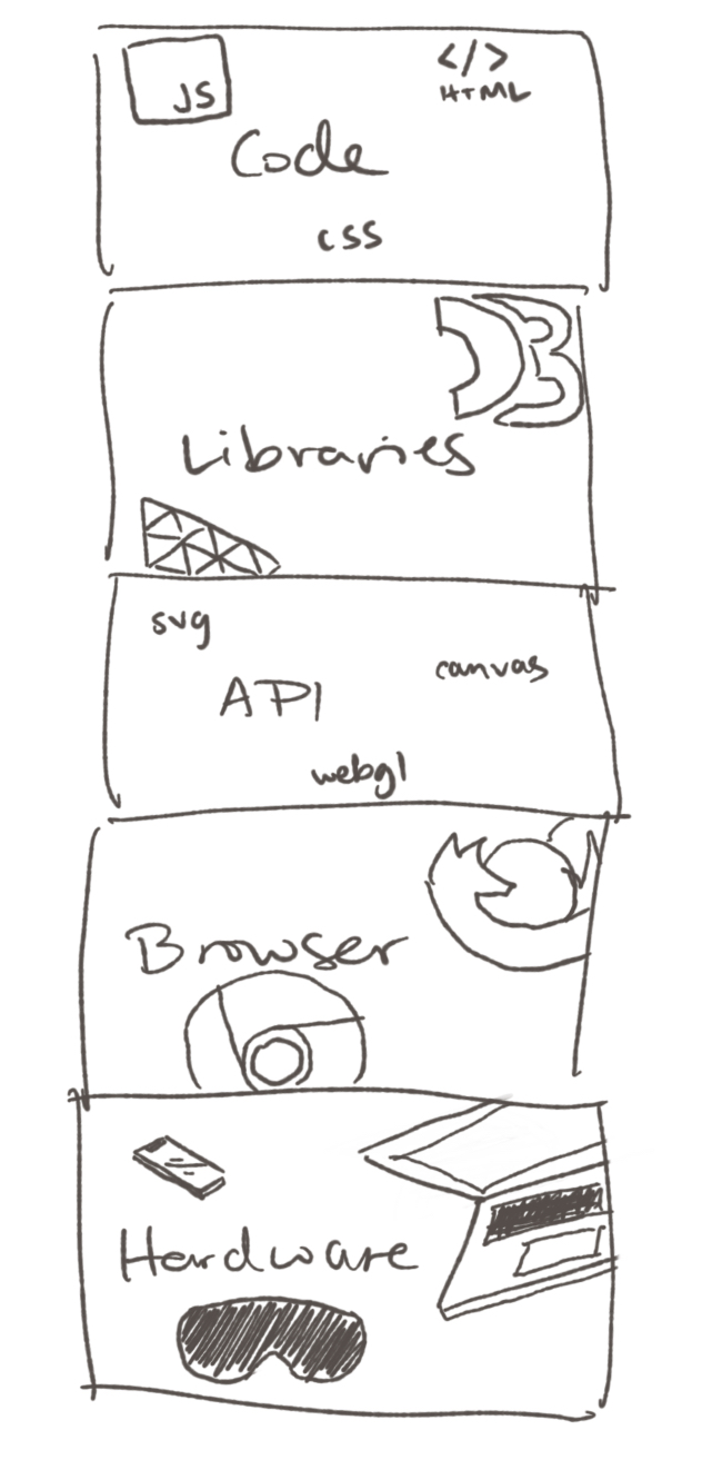
From the devices your audience use to the libraries you write your code with, every appearance of a visualization is unique. Every time a visualization renders on screen, is has to go through many layers that come together for the final experience:
Two differences, three bridges
There are two fundamental differences between SVG, Canvas, and WebGL that determine what your visualization will (and won’t) be able to do:
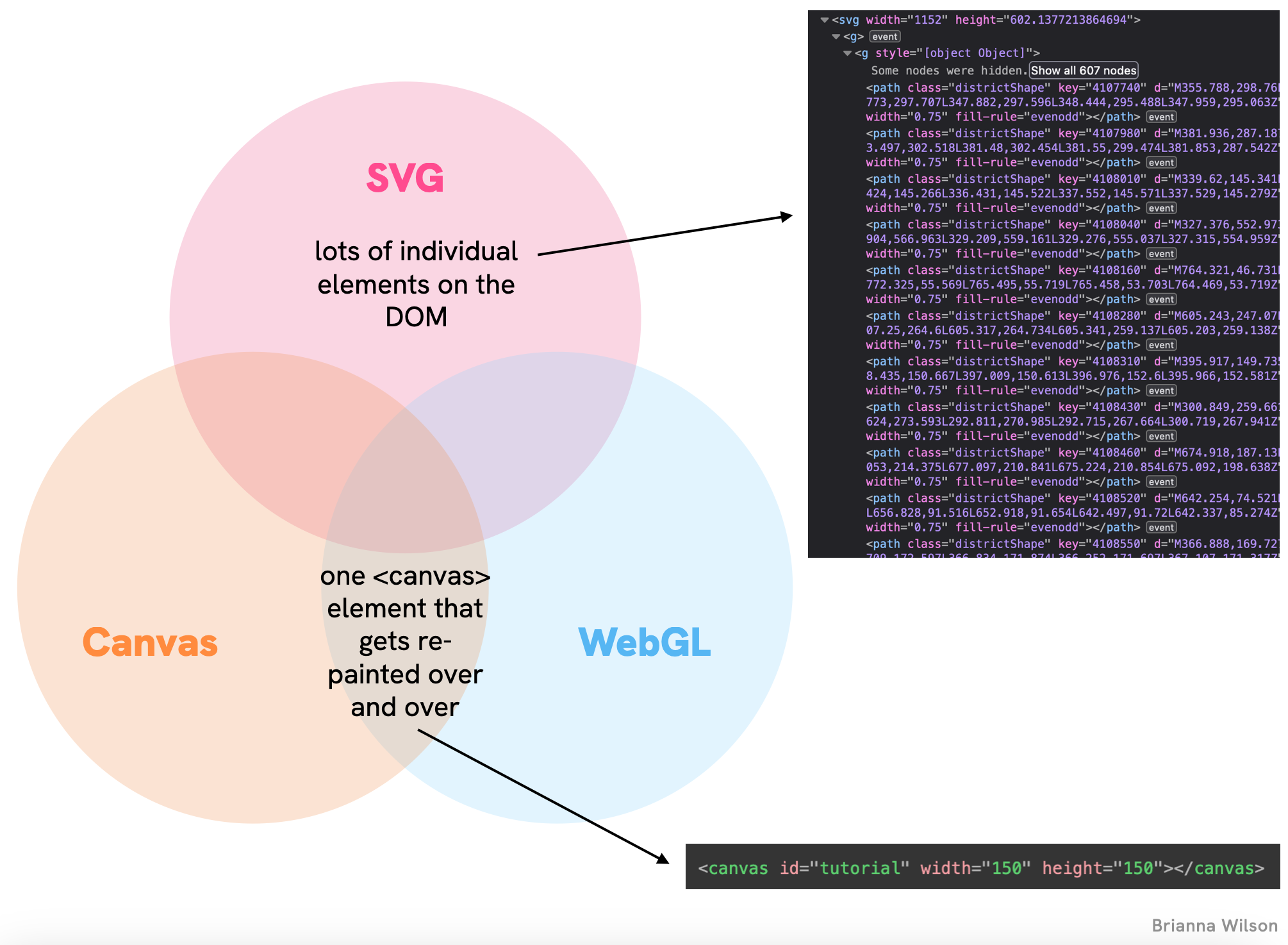
The first major difference comes down to how these APIs interact with the Document Object Model (DOM) - the structure browsers use to organize webpage elements
With SVG, every circle, line, and text label gets its own element cozily tucked into the DOM tree. This makes it easy to select and manipulate specific elements, attach event listeners, and handle accessibility. But all those elements can slow things down when you have too many.
Canvas and WebGL, on the other hand, work more like a painter’s canvas — everything gets flattened onto a single element (conveniently, a <canvas>). Need to change something? You have to repaint the entire scene. It’s less organized, but more efficient for complex visualizations.
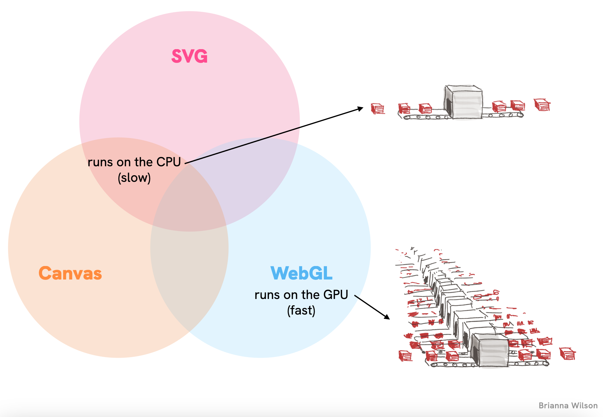
The second key difference is which part of your computer’s hardware does the heavy lifting:
SVG and Canvas run on the CPU — the general-purpose processor that handles most computing tasks. It’s like having one very smart worker who has to handle each task one at a time.
WebGL, meanwhile, taps into the GPU — the specialized processor that was designed specifically for rendering graphics. It’s like having a team of hundreds who can handle many simpler tasks in parallel.
These two differences combined create three distinct realms of visualization possibilities, each with its own sweet spot.
What can each API actually do?
2D vs. 3D
The number of elements that can be animated at any one time
The complexity of artistic effects (gradients, transparency, shadows, textures, etc.)
So, which API should I use?
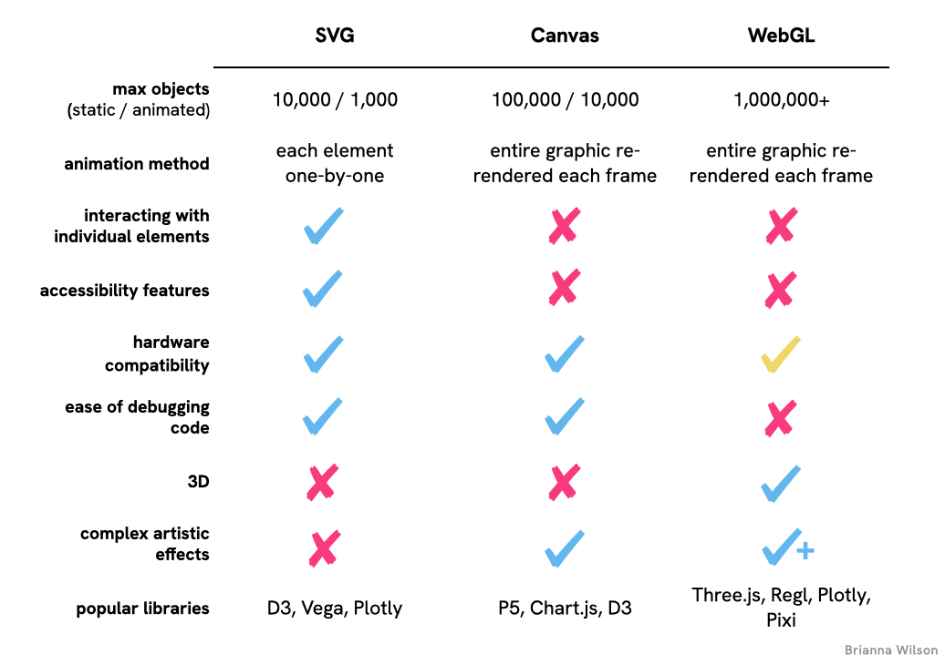
Once you’re clear on what your visualization is going to be, you’ll be able to figure out what will be the best tool to use. To make it easer to decide for your case, here’s a table summarizing everything we’ve covered. Note: these aren’t aboslutes, they’re just the relative strengths and weaknesses between the three APIs. For example, you can get Canvas to handle accessibility features, it’s just something you have to build on your own:
Where to go from here
If you’re itching to venture beyond the familiar territory of SVG, stay tuned for upcoming posts on:
The basics of using Canvas and WebGL
How to set up each API and where their approaches diverge
Create a morphing data visualization using Canvas
We’ll build a visualization that transitions data points from a map shape to a bar chart
Create a 3D network graph using WebGL
An easy(ish) way to create a stunning, interactive 3D network visualization with actual glow effects
Let me know which API you’re most excited to learn about, or if you have questions about choosing between them for your visualization!